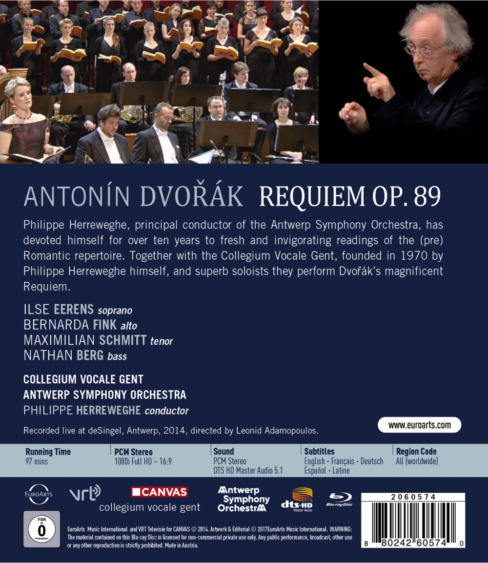
Dvořák Requiem. In 2014 Philipe Herreweghe conducts the Antwerp Symphony Orchestra and the Collegium Vocale Gent in a performance of Dvořák's Requiem. Features soprano Ilse Eerens, alto Bernarda Fink, tenor Maximilian Schmitt, and bass Nathan Berg. Directed for video by Leonid Adamopoulos. Released 2017, disc has dts-HD Master Audio. Grade: NA
Herreweghe, the Collegium Vocale Gent, and Leonid Adamopoulos teamed up in 2012 to give us a warm, beautiful Bach Christmas Oratorio, that we graded B+, which is a good grade on this website. I'm happy to report that this Requiem is a breathtaking performance, extremely nuanced and professional on all counts, that Herreweghe leads with intensity and focus. The orchestral and choral sounds are ravishing, with the woodwinds coming through especially well. I was also impressed by the strong soloists and the choir's balance. The conclusion of the Sanctus is especially thrilling.
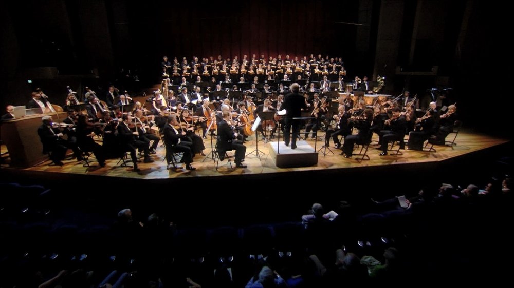
Now to some screenshots. The video is very clear thanks in part to bright lighting in the concert hall. But the forces used for this performance are huge! You would probably need 4K resolution to get clear shots of all the performers in a single image. The image next below qualifies as a whole-orchestra shot; but at this range it's really hard to distinguish the various instruments:
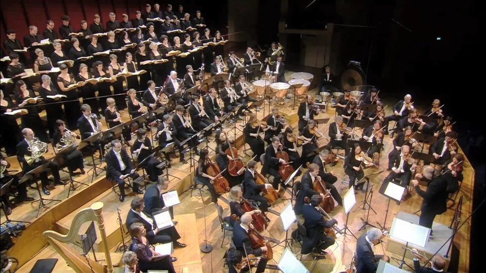
The large forces on the stage doubtless contributed to the decision to shoot the video DVD style. But as you see below, there are at least a few large-scale, part-orchestras shots that help the viewer get properly oriented to where the sections of the orchestra are located:
And there are some nice section shots like we see next below --- first the cellos and then the second violins:
Here's a good view of most of the chorus:
And next below is a realistic view of the 4 soloists in their environment:
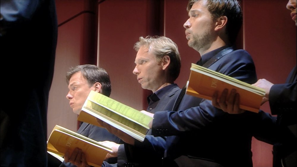
Still, most of the clips in this video are small-scale like the next 3 shots:
(This shot also suffers from a weak angle:)
And here next is what we call an "unrealistic" view of a soloist. No one in the audience could see this:
The above shots are what I would call “normal” small-scale images. This title takes things further, giving us numerous ultra close-ups. I have pictured below a horn player, but you will get the same uncomfortable opportunity to invade the personal space of the principal flautist, the tuba player, female and male choristers, and others:
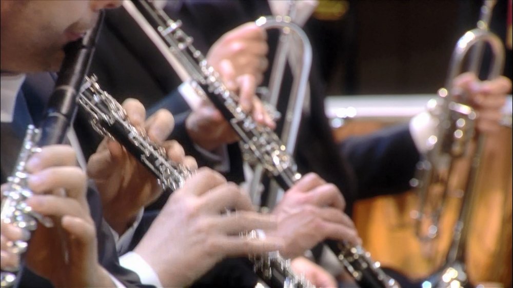
Given the apparent obsession with ultra close-ups, it perhaps shouldn’t be surprising that we get a lot of instrument-only shots. Some are more successful than others, given the difficulty in maintaining a good focus on instruments that are constantly in motion. The example below might be scored with 3 errors: (1) instrument only, (2) out-of-focus, and (3) strange framing:
In near-range shots, we admire images with enough depth-of-field-of-focus to show clearly everything we are interested in. This is harder to do than to discuss. Consider the 2 views below of 6 ladies in the chorus. In the first shot, only 1 lady is in focus. The cameraman tries to improve on this a split-second later in the second view, where he gets 2 ladies in focus. Which view is better? Is either acceptable?
I don't think it's necessary to "run the numbers" on this this title to give you an adequate report. Despite the challenges with the visual production, Herreweghe delivers a fine performance of this very satisfying work. And Dvořák does not disappoint with memorable tunes, moving climaxes, and many moments of concentrated tenderness. I wind up with another B+ for Herreweghe and team, which is still a good grade on this website! If you are not too concerned with video content, this might be considered one of the best recordings ever made of the the Dvořák Requiem, so you need not be wary of it.
Here's an official clip showing excellent PQ together with some examples of the DVDitis I discussed above:
OR
