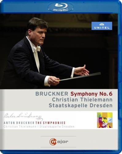
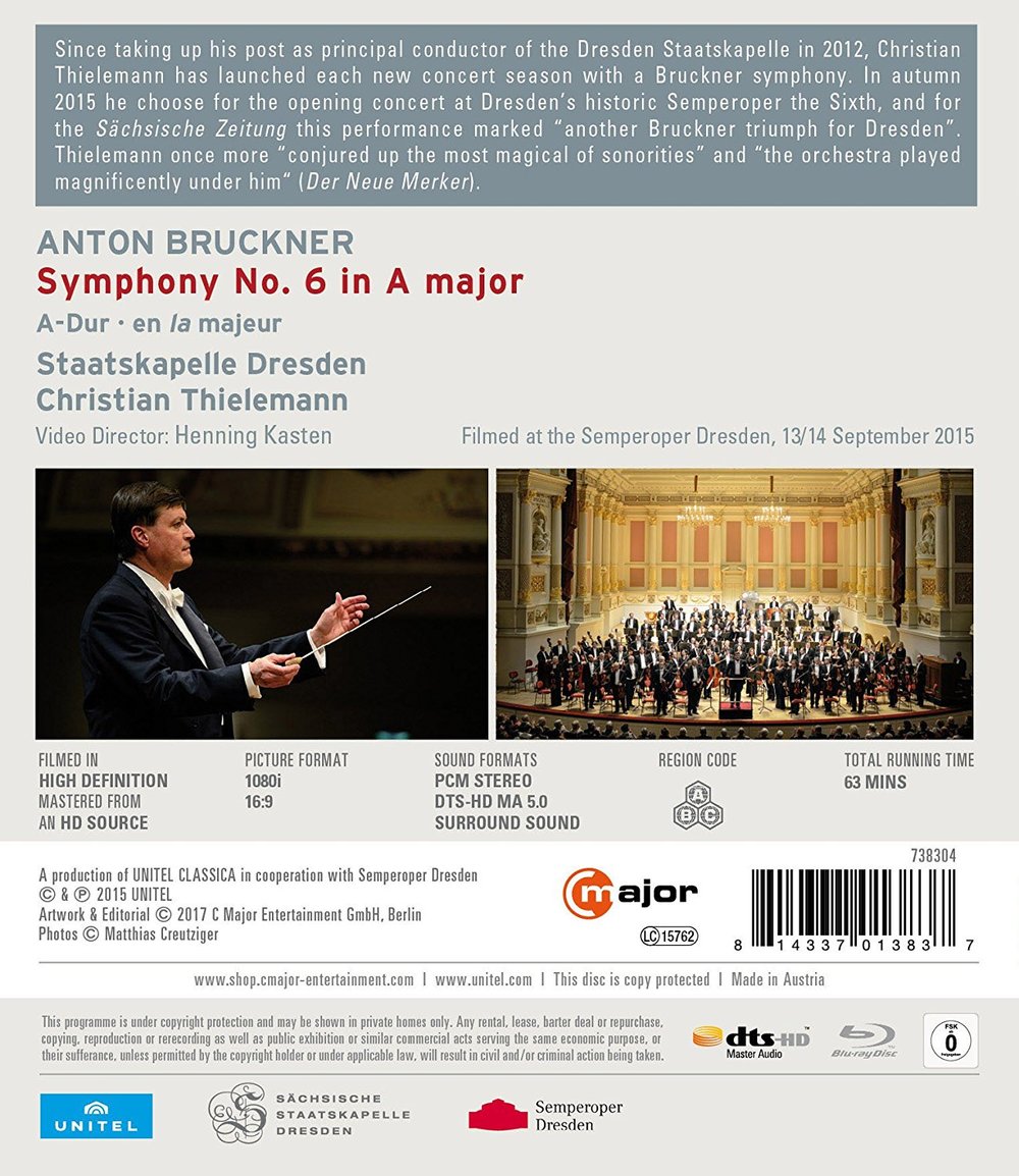
Bruckner Symphony No. 6 conducted by Christian Thielemann at the Staatskapelle Dresden in 2015. Directed for TV by Henning Kasten. Released 2017, disc has 5.1 dts-HD Master Audio sound. Grade: D+
Christian Hoskins, writing in the April 2017 Gramophone at pages 50-51 roundly praises this musical performance. He also writes the only full paragraph by a print critic I've seen yet (in 9 years of reading) about a video recording of a symphony. So here goes:
“Video director Henning Kasten, who also oversaw Thielemann's account of the Eight Symphony, maintains visual interest with a well-chosen mixture of close, medium, and distance shots while avoiding the constant use of movement by Agnes Méth in other installments of the cycle. The camera work includes a number of interior views of the Semperoper as the orchestra plays, which helps create the impression of being at the performance.”
Hoskins in his first sentence sums up our philosophy of what makes for a good symphony video. And he is correct that Agnes Méth is associated with hyperactive video (a bit more on that later). When it comes to the symphony video, Hoskins has his heart in the right place. But being a print critic, he just doesn't know what he's doing. (I bet he wrote in his article whether he saw this in DVD, or Blu-ray, or both. Then his editor cut it.)
If Hoskins were to read the rest of this review of this Bruckner Symphony No. 6, he would then know better how to judge a Blu-ray symphony video. So let's get on with it.
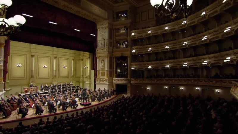
The first obligation of the videographer of a symphony is to show the video viewer an image of the whole orchestra so the viewer can get oriented to what is to follow. The image next below appears before Thielemann first enters the stage. This image shows the entire orchestra, but it is not a whole-orchestra shot for our purposes. It is what we call an architectural shot--- one that shows the entire general scene including parts of the beautiful building.
There's nothing wrong with including architectural shots in a symphony video. But the whole-orchestra shot we require for orientation shows all the players taking up the entire image from side to side. The whole-orchestra shot needs to be close enough that the viewer can distinguish the various instruments and see where the different sections of the band are located. In the picture below, you can just barely count the 8 double basses and spot the tympani. Otherwise, you can't tell who is who:
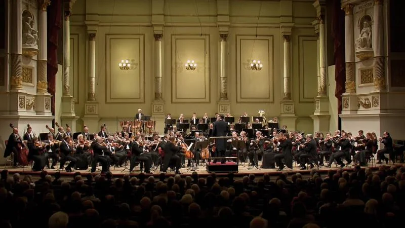
The next view below is a tad better, but it still is not an whole-orchestra shot:
Next below is the best whole-orchestra shot Henning Kasten could come up with. But it still falls short of what we demand because the camera angle is too low. The players on the front of the stage block our view of the players behind. Even though the range is correct, the image fails because orchestra management did not put enough risers on the stage and/or did not insist that Kasten place a camera high enough in the hall to get a good angle down on the players before him:
So with this large orchestra, the videographer has to go to part-orchestra shots to allow the viewer to see where the players are on the stage. Alas, the part-orchestra shot next shown is also too low — this is so frustrating!
As I will show you later, there are only 6 whole-orchestra and part-orchestra views in this entire video, and all of them are seriously defective for lack of enough elevation. So Hoskins is sadly over-optimistic when he writes of "distance shots." In this video, there is not a single decent distance shot.
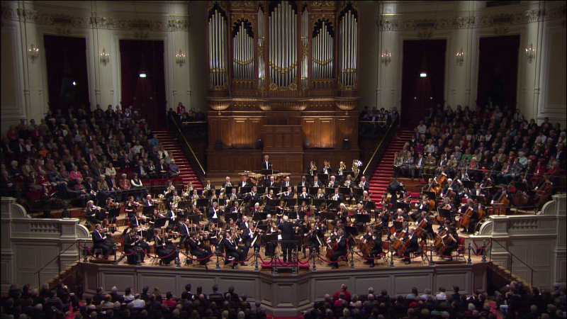
Now I think I should show what a proper whole-orchestra or distance shot should look like. The next image is comes from a video of the Concertgebouw Orchestra playing Bruckner Symphony No. 9:
The first of the two images above allows the viewer to see how the orchestra is organized for this performance. True, a few of the 1st violins are not seen on your left, but this would still be considered a whole-orchestra view. The second of the images above is a tad too long-range, but it does show you the entire huge band on the stage. If the video doesn't have views like these of the Concertgebouw, then the video is defective at birth.
Getting back to subject video made at Dresden, we do enjoy about 28 mid-range shots like the next view below of most of the double-basses and some other strings. We have to be grateful for whatever good things come our way:
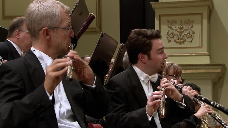
53% of the clips in this Dresden video are DVD-like close-ups of single players or small groups. Next below are 2 very pretty examples of this:
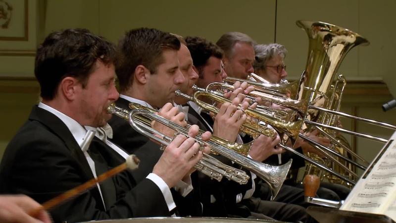
But alas, most of Kasten's cameras seem nailed to the floor and incapable of shooting from any kind of elevation. Next below is the brass section shot from their right. This image is miserable. It should have been shot from a position closer to the center of the group and with more altitude:
Over and over again Kasten winds up shooting down the row. Here he does the brass again from the other side --- this is really ugly work:
More shooting down the row:
This video also has 19 conductor-over-backs shots such as the next view below. All such shots are abominations as they convey little about the conductor while insulting about 100 of the best musicians in the world:
There are also 43 lazy instrument-only shots in this video. All of them are bad, but the two shown below are compounded by additional focus and framing errors:
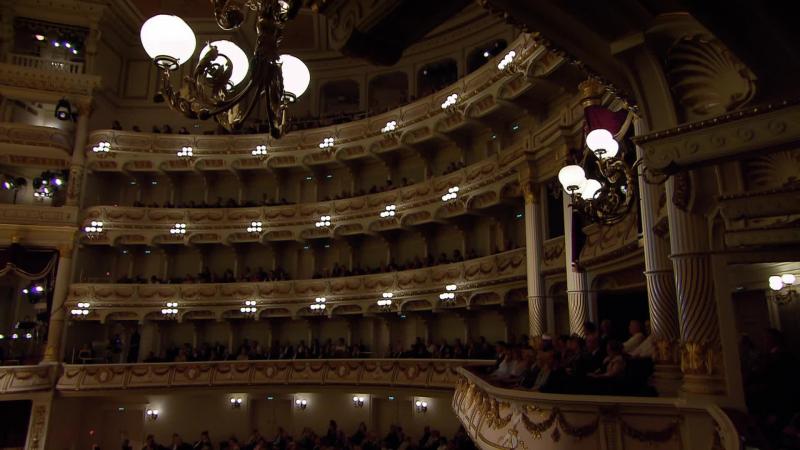
Finally, I disagree with Hoskins when he approves of shots of the building during the performance. When I'm at the symphony, I watch the orchestra when it's playing. I look around at the building before and after the show and at the intermission. So pictures of the building like that below normally should be shown before and after the music. (Videos made in famous glorious churches can be an exception to this rule.)
You might wonder where I got the numbers I mention in my comments above. I'll tell you where. I did a Wonk Worksheet on this title which clearly lays out in numbers all about the content of the video. To learn more, see our special articles on (1) the requirement for a good symphony video (2) where to get a Wonk Worksheet, and (3) how to use it.
We have established the following standards for judging video content:
“A good HDVD should have a slow pace with more than 10 seconds per video clip on average (longer the better). 20 to 40% (higher is better) of the clips should be large-scale "supershots" (whole-orchestra, part-orchestra, multiple-section, and large-section shots). Conductor shots should be less than 20% (way less really) of the clips in the video.”
As you can see on the Wonk Worksheet, subject video has a pace of 7.5 seconds per clip, which flunks the "pace" test. (The typical pace of a Agnes Méth video is about 5 (insanely fast) seconds per clip. For an example, see our discussion of a Méth video of a Beethoven Symphony No. 3 recording where her pace was 5.6 seconds per clip.) Only 8 percent of the clips here are "supershots", so the video flunks that test also. Finally, at 25% conductor shots, this video, borne defective, is clearly going to crash and burn.
These grim statistics drag this title down on bad video content alone into the C- zone. Add to this the stingy 58 minutes of music as well as all the errors discussed above, and I could consider a F grade for this title. But I'll also note that the PQ is excellent. And I agree with Christian Hoskins that was a fine performance with adequately recorded sound. So I'll be generous and bump the grade up to D+. This Blu-ray was obsolete the first day it was published and you would buy it only for some special good reason.
I have one more comment for Mr. Hoskins. Sir, I'm not trying to be hard on you. I enjoyed your review and was happy to see you heading in the right direction. Alas, the neglect of classical music video recordings by the print critics reminds me of those circus elephants you used to see enter the arena each with his trunk grasping the tail of the preceding beast. The first elephant bears the sign "Buggy Whip." The elephants following are named "Remington Typewriter", "Kodak", "Polaroid", "Newspaper Classified Ads", "Paper Maps", and "Gramophone."
Here's the official C Major trailer, which briefly but clearly shows some symptoms of DVDitis discussed above:
OR

